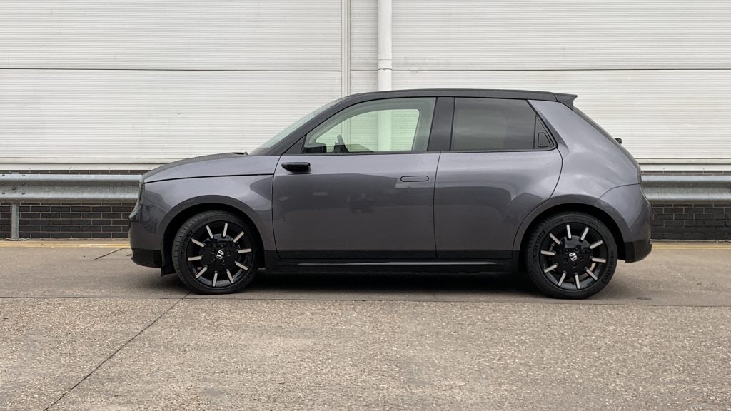
The robot server’s design had prioritized not spilling scalding coffee over customers above an anthropomorphic appearance, but as consumers we now usually expect our advanced technology to blend seamlessly into our lives. Fussy ’80s-style electronic fetishism is out. Glossy surfaced, buttonless mobile phones and soft touch smart speakers are in. Approachability and friendliness are the new watchwords, and it’s a look the Honda e leans on heavily.
The Concept Versus The Production Car
The e, a city-friendly electric car sadly (for you) not sold in North America, originally appeared as the EV Urban Concept in 2017, and the production version was shown in 2019. Everyone moaned the one you could buy didn’t look exactly like the concept (they never do, for good reasons), but given there were only two years between them, the production version would have already been signed off in 2017. I was never totally convinced by the Urban EV concept – I thought it a bit heavy and slab-sided, too flat in the roof line, and sit down for this revelation – over-wheeled.
Before we get into the details, let’s have a quick look at what makes the production version so much better than the concept. Mainly for me, it’s about that reduction in wheel size. The overall proportions are less stretched and forced, so the front and rear graphics don’t have to work as hard. There’s more room for the individual elements to breathe on the real car, rather than everything looking like it’s being squashed into the form. The slabbiness that I think the concept suffers from is reduced here. Finally, the black paint that tops and bottoms the production car just makes it look so much lighter on its feet.
Let’s Dig Into Why This Exterior Design Works So Well
I’m always banging on about how car design is not just about looks, but content and context as well. What is a car meant to be, how does it sit in the marketplace, and how well does it fulfill its intended function? Honda has pitched the e as a premium urban commuter car for those who might have a Noguchi coffee table or an Eames lounge chair. In other words, it’s aimed at wankers like me. (I have neither a Noguchi table nor an Eames lounger, but I have a friend who has both. Bastard).
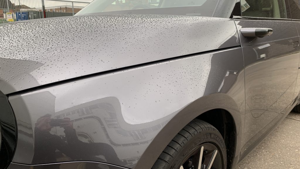
Interestingly, the exterior and interior are thematically a bit of a mismatch — not bad, just different ideas. But we’ll get to that. Looking at the exterior, what strikes me first and foremost is that it’s a much calmer, more mature effort than some other recent Hondas. The previous generation Civic looked like it was mid-transformation into a 20-foot tall robot, something that has been wound back on the current gen. The feature lines to nowhere have been banished. Every line on the e serves a purpose, and the shut line management is exceptional. The panel gap around the hood always needs to be bigger to allow what is called an “overslam” condition – the amount it travels past its resting position when being closed. Honda have pulled a Land Rover and used a clamshell-style hood that allows the gap to become a line on the body side that takes a turn vertical on the C pillar before blending out near the roof. It’s the only decoration on the body side apart from a subtle light catcher on the rocker panel.
The e has frameless doors, which means you have fewer runners and seals around the glazing area. Look how clean that area is. Remember our chat about the new Prius and its less than optimal door mirror area? Even though the e has camera pods instead of mirrors, it still needs a small trim piece in the corner of the DLO to provide a runner for the glass to drop. On the rear glass, there’s a similar arrangement that provides a hiding place for — fuck my life — hidden door handles. I’ve ranted about these before but I will say here they don’t provide as nice an interaction as the pop-out fronts. The way the triangular shape becomes the seal between the metal and glass is very neat though.
Talking about glass, the chart port cover is that black glass panel in the middle of the hood. When plugged in and charging a blue light slowly pulses like a heartbeat, a humanistic touch ripped straight from the Cupertino design manual. Although the car has cheerfully round headlights, Honda have wisely resisted the temptation to go full kawaii, but there’s a hint of Tomotaka Takahashi’s humanoid robots in the front and rear graphics. It could really use some punchier colors though – there was a bright neon green that’s been dropped. A nice bronze or metallic brown would really make this thing sing, and tie in better with the warm interior.
The Cabin
Honda has made a big deal about the interior being a “living room” inspired with widescreen displays and an earth tones colorway – both the seat belts and the contrast stitching on the doors are brown, but the wood is slightly disappointingly, plastic. Would it have killed them to use real trees? It is a sustainable resource after all. Did I feel like I was in my living room? Well, I have a 4K Samsung and the UI on the two widescreens on the Honda’s IP is just as bad, and there is a 240v household outlet lurking amongst the plethora of ports in the central area under the dash, so maybe. You don’t have to pick too hard to reveal the Android Auto bones underneath the cherry blossom tree wallpaper though. The screen in front of the driver is typically Japanese in that it’s clear but busy – like the menu of a Hideo Kojima game – with all the information, all the time. For such a design-led car, it’s a shame they didn’t put more effort into giving the interface a bit more love.
Although the only way of interacting with the screens is via touch, there are hard controls for the important stuff like audio and HVAC, and the drive mode on the center console is excellent. You can go from park to reverse or drive or one pedal mode by feeling alone.
The bit I’m sure you’re all waiting to hear about is the camera mirror system. This uses two cameras in each door to provide a view of what’s behind you on the two outmost screens. It works really well with one small caveat – although the cameras are adjustable like a normal mirror you lose the ability to change your view by changing your head position. As someone with a motorcycle license, my head is constantly on a swivel when I drive, so with the dicey short on-ramps of the Coventry ring road, I quite often lean forward when looking in my mirrors to get a clear view of all the lanes behind me, lest I turn the Range Rover into a big metal ball on the nose of a heavy goods truck with a late delivery of lettuce.
At night time with headlights behind you, the images have more lens flare than JJ Abrams’ showreel, but that’s probably a consequence of having one camera that can work equally well in both daytime and nighttime. Why do it? With an ICE car aero only makes up something like 30% of its overall efficiency. With an EV, it’s something like 80%, so those small gains are really important, so although these things feel like a solution in search of a problem there is a good reason for them. It’s just that reason is not repairability for the third owner. The thing I like most about the Honda e is the fact it doesn’t scream “space car of the future.” There are no green or blue highlight colors, no corny leaf graphics or any eco-weenie nonsense about its appearance. It’s a confident, modern design that happens to be an EV. The fact is it could work equally well as a template for the next Honda Fit or Civic as it could for a new Insight or Clarity is a testament to how, as always, good design is universal.
Here’s What It’s Like To Maintain The World’s Quirkiest Car Collection
Corvette Is Reportedly Going To Become A Brand With A Sedan And Crossover
The New 2023 Honda Accord Loses The Two-Liter Turbo Engine But Looks Quite Fabulous
The Honda e:N2 Concept Channels All The Weirdness Recently Suppressed In Honda’s Design Studios
Here’s Every Car The $43,990 Honda Civic Type R Competes With
Want to write for The Autopian? Pitch us here. Or check out the stories on our homepage.
The exterior maybe less so, but I think if you parked the e next to a ’74 Civic the inspiration would be more obvious.
I haven’t gotten used to a dashboard full of screens, and likely never will. They seem out-of-place for a simple Transportation Unit. I would find a dial or two, the essential buttons and levers and a simple audio system more congenial.
But I like the little Honda visually, for many of the same reasons I liked the R5. It shows how handsome a simple, useful shape can be.
That’s amazing engineering on Honda’s part! To be able to shift the car based on your emotional state?! I feel alone all the time, but my stupid Pilot doesn’t do crap. Thanks for nothing, Pilot. (Kidding, obviously…I know what you meant)
On a more serious note, I do love that car. I love when cars are just simple. Like you said, the car isn’t trying to be more than it is. Just nice, clean design, with no useless bits and baubles, and a laser-focus on the vehicle’s purpose in life. But I do hate our camera-mirror future. Unless those things start incorporating head and eye tracking, moving the camera based on where you’re moving your head, these things are just a bad idea.
The interior looks like it would be a serene place to be (love the upholstery), which supports the EV ethos of smooth and quiet. The horizontal dash element is again a subtle homage to the Civic, which had a utility sunglasses/pen/change shelf at that location.
I wish we could get this in the US.
This is one of the biggest losses in using any sort of digital mirror. I get the aero concern, but it’s a significant tradeoff. And I hate digital rearview (except in specific applications in which a mirror is impractical, such as some RVs) because it doesn’t even solve an aero concern.
But I absolutely hate the whole “dashboard-as-a-screen” thing with a passion – if they stripped that shit out and gave me a few basic HVAC knobs/buttons, an AUX input and a volume knob I’d be happy as hell.
The regulations on minimum mirror size need to change.
After eliminating ICE, the next biggest vehicle pollution issue is tire particles. Both in the air and ground/water. If we continue this trend of essentially eliminating the tire, our kids will be able to breath rubber free air. I’m not sure if magnesium particles will be better, though. Or what the traction will be like…
It reminds me of a more sophisticated dodge neon, in that the vibe is friendly/approachable, not trying to look ALL AGGRESSIVE AND ANGRY LOOK AT MY VENTS AND SCALLOPS AND CREASES RAHHHHH so played out. I like it a lot.
Also, I have something to add about the side view mirrors. Like 10 years ago I had a long commute, and started modifying a 91 Civic for hypermiling/aero mods. Removed wipers, applied rainx = +1mpg at 80mph. Lowered it, smooth wheels, removed mudflaps, another 1-2mpg. BIGGEST win tho?
Removing those side mirrors. From an aero standpoint, they are so dirty! It gained a whopping 3MPG removing the side mirrors at 80mph, with a surprise benefit of reducing a massive amount of cabin noise at that speed; the turbulence of traditional mirrors right next to your head is actually quite loud!
And for the safety nannies, I blocked off the mirrors mounts with black ABS, and installed two convex mirrors inside the car instead, worked fine for freeway driving.
But it still sucks given the short 140 mile range due to the undersized battery.
Overall, though, it is a very nice design. It is simple, but distinct.


